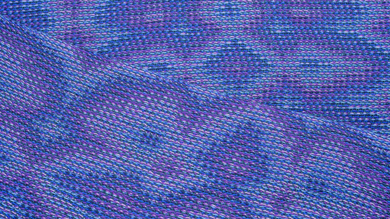
Warps with multiple parallel lines have drawn me to using rainbow colors. It took a while for me to appreciate that dialing down the color volume gives equally interesting results. For one of my latest shawls, I stuck to a warp of blues and purples.
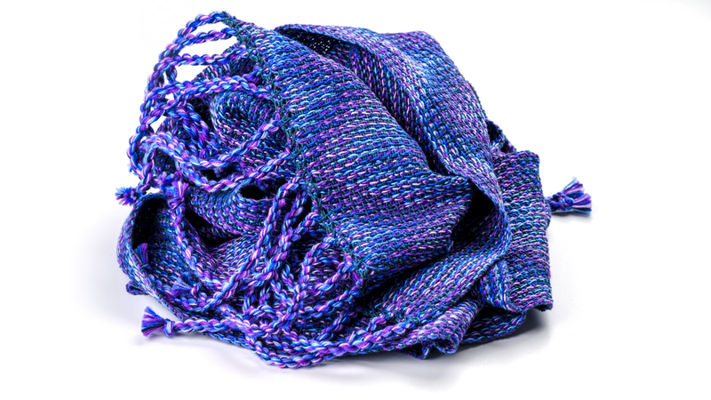
From tint to shade and back
I wondered what the effect of a light-to-dark gradient in the warp would be in an echo-8 design. At first, I wanted to make a monochrome warp with 8 shades of a single color. I thought this could be wonderful, but I feared that the threading of the heddles would become almost undoable with colors that are so much alike. I currently wind my warps holding 8 ends together and this works out well in most cases. However, picking the right color sequence each time out of a bundle of 8 comparable colors is prone to errors. It is still on my wish list to learn how to use a warping paddle, which would be of great help in this case.
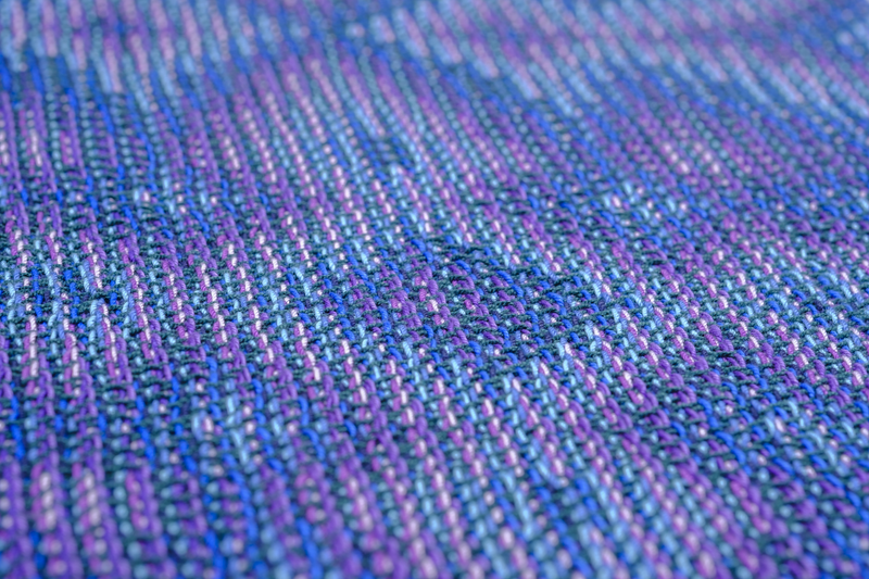
So, I decided to put my monochrome warp on the back burner for now, and to make a warp out of 2 colors instead of 1. I came up with a palette of 4 blues and 4 purples. My harmonious color sequences went from tint to shade and back: from pastel blue to marine, and then from deep violet to lilac. A quick google search taught me that such a color palette is referred to as analogous.
Colors are analogous when they are neighbors on the color wheel, such as blue and purple. For my weft, I decided to go for the other neighbor of blue, also known as green. I picked a very nice deep forest green which complements the blues and purples beautifully. Again, I went with the lace weight crochet cotton yarn, my new go-to yarn for echo projects.
Going macro
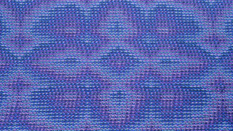
With my color palette ready to go, I started designing. Every square in a design line represents 8 warp threads. Therefore, a design becomes 8 times as wide in the actual weaving draft. As a result, motifs in the design line blow up once you add the parallel lines. It is quite easy to design motifs that cover the full width of a shawl in this way. I went for a flower-like design, which looked cute as design line yet impressive as weaving draft.
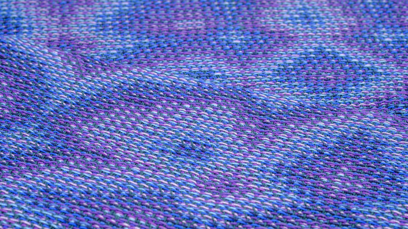
I was reminded of macro photography, which also allows you to take something small and turn it into something big. A cute little flower of only a couple of millimeters wide can be enough to make a screen-filling photo with lots of details too small for the naked eye to see. I imagine that applying a weaving technique like echo-8 to a design line is a bit like this as well: a design line holds so much potential and turning it into a weaving draft allows you to see this.
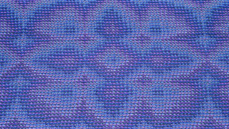
I thought it was a fun idea to see my shawl-covering flower as a macro version of a small flower. When I think about little purple flowers, my mind goes to blooming heather. So, I pictured my design as a little heather flower. I even found out that my design with 4 small petals and 4 larger petals resembles that of a heather flower. As such, the heather in bloom shawl was born.
The weft effect
From this point on, it was smooth sailing. I worked with this yarn before and I made several echo-8 projects already. So, everything was familiar except for the beautiful interplay of blues and purples appearing on my loom. I really like how the pastels flow into the dark colors and back.
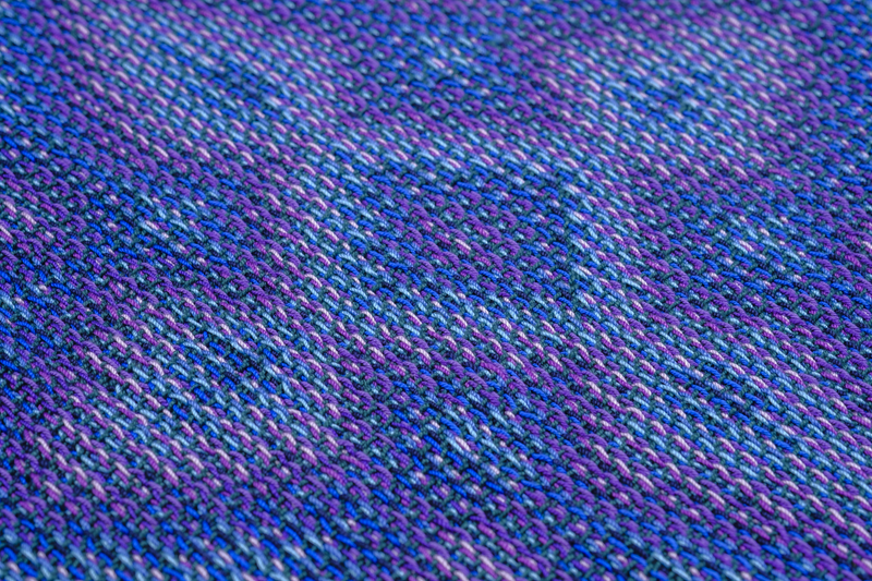
The green weft combines well with the warp colors. I am always tempted to go for a black weft, as it makes the warp colors pop. Yet, I am always happily surprised by the effect of a colored weft in a dark shade. It also brings out the warp colors but the result is a bit softer than when using black. Especially when the weft color is of a different hue than the warp colors, the weft color really adds to the overall look of the cloth.
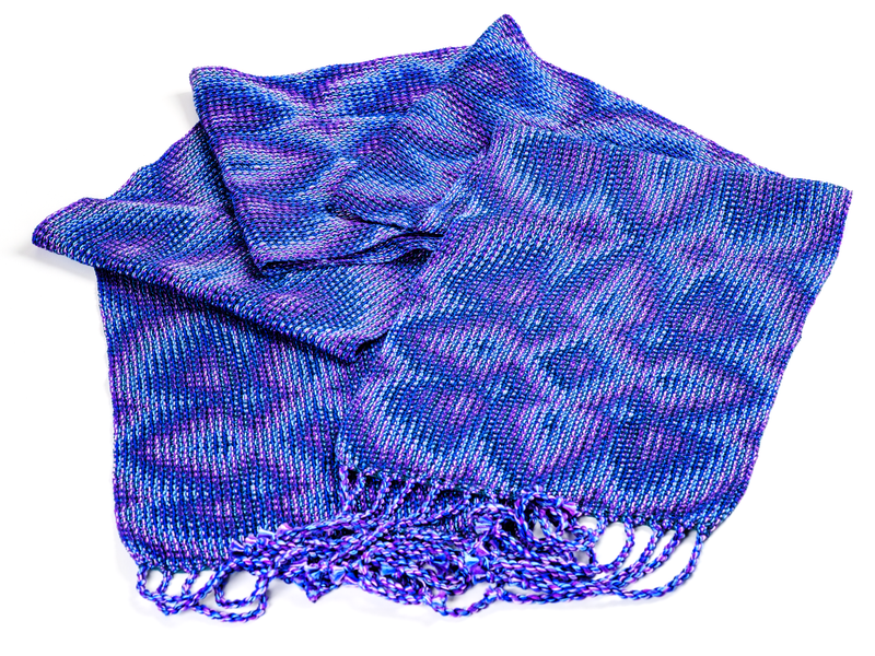
All in all, I liked playing around with an analogous color palette. It makes me want to experiment with monochrome warps more often. Let’s see if I can become acquainted with the warping paddle soon.
