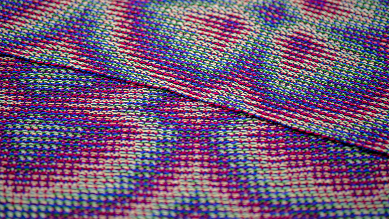
Working with 8 warp colors in echo-4 and echo-8 designs gives room for ample color combination experiments. After I tried out a bright colored rainbow, I wondered what result a combination of light, bright and dark colors would bring. The color combination I came up with looked rather curious as a mere warp, but turned out to be a wonderful palette once intersected with weft threads.
Of hues, tints and shades
These explorations of color combinations have stirred up my interest in color theory and I am trying to get more acquainted with the terminology along the way. As I understand it, hues are pure and fully saturated colors. These colors are what I would refer to as bright colors. Adding white to a hue gives tints, adding grey gives tones and adding black gives shades. Tints make the hue lighter, while shades make the hue darker. Tones give a more muted version of the pure hue. In my new project, I wanted to combine light, bright and dark colors, another way of saying this would be to combine tints, pure hues and tones.
I decided to stick to my 8-colored rainbow of pink, red, orange, yellow, green, turquoise, blue and purple. For each of these colors, I had to chose whether to go for a tint, hue or shade. Weaving software is indispensable in such an exercise. It allows you to try out all the different color combinations you please with just a few clicks.
My first idea was to alternate light and dark colors: light pink, dark red, and so on. The result was not very exciting. It looked dull to me, not one of the colors stood out. So, I turned to grouping the tints and shades. This approach was more successful. I saw the shades taking centre stage and the tints providing more of a background. For example, the result was very warm and reddish when choosing shades of pink, red, orange, yellow and tints of the other four colors.
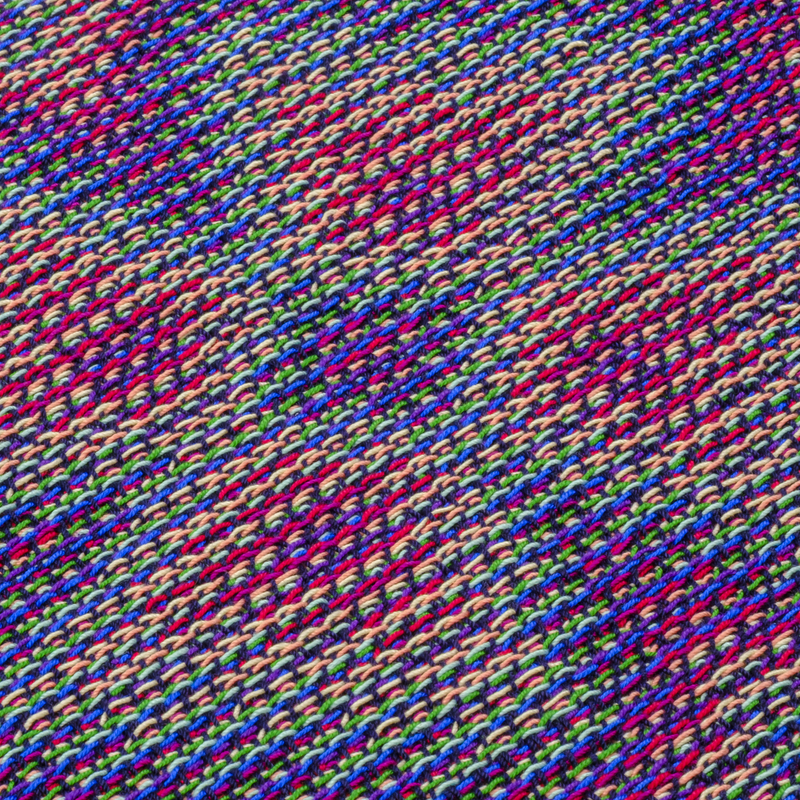
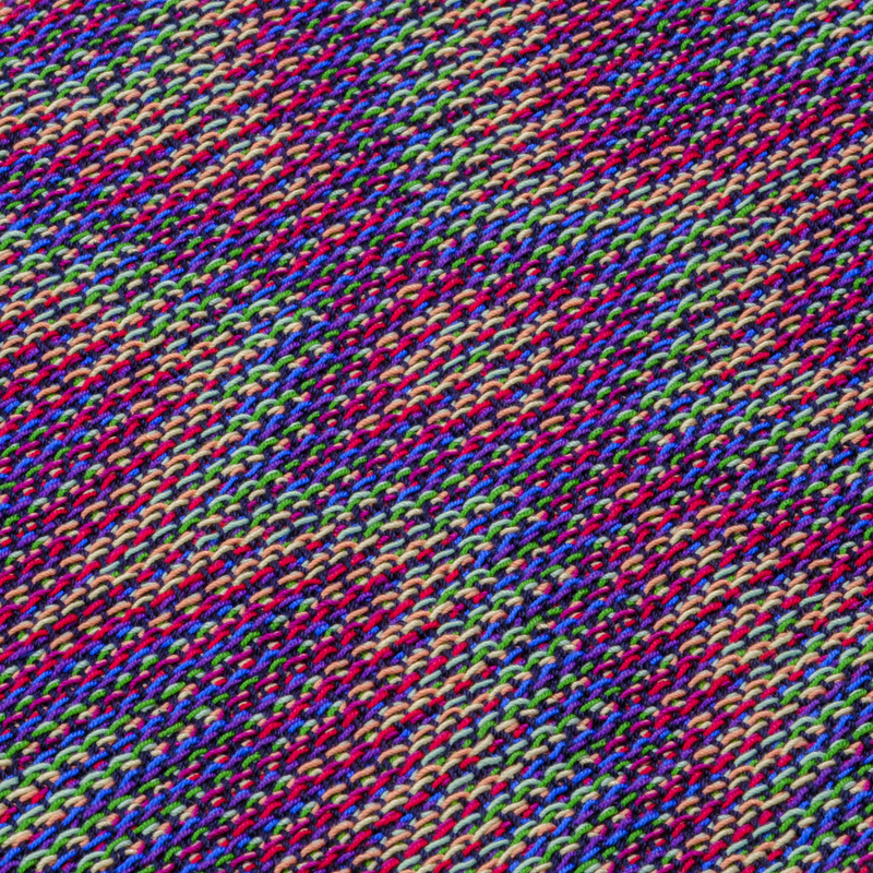
I also liked the effect when I added bright colors as ‘transitions’ between the tints and shades. The final combination I settled on was: dark pink - bright red - light orange - light yellow - light green - bright green - dark blue - dark purple. So, I changed the rainbow up a little bit by going for bright green instead of turquoise. I love turquoise, but I feel like adding it to the palette has a rather big impact on the end result, so I decided to leave it out this time.
Try to keep faith
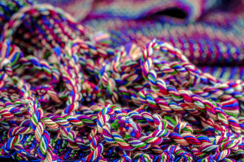
The design I came up with is a flower-like pattern. My choice of warp colors and marine weft colors looked beautiful in Fiberworks and I was excited to start weaving. I turned to my new-found-favorite crochet cotton thread once more, as it comes in so many colors.
I chose a sett of 10 epcm, which makes the shawl slightly warp-dominant. To obtain ‘square’ flowers after all, I adjusted the treadling sequence accordingly. Threading and treadling are based on the same design line. The threading sequence became 8 times as long due to the 8 parallel warps. I expected to weave about 6-7 picks per cm, so I elongated the design line with a factor 5 instead of 8 for the treadling sequence. I then turned this into a weavable network sequence.
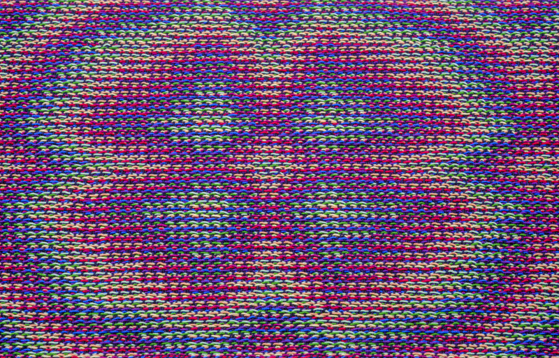
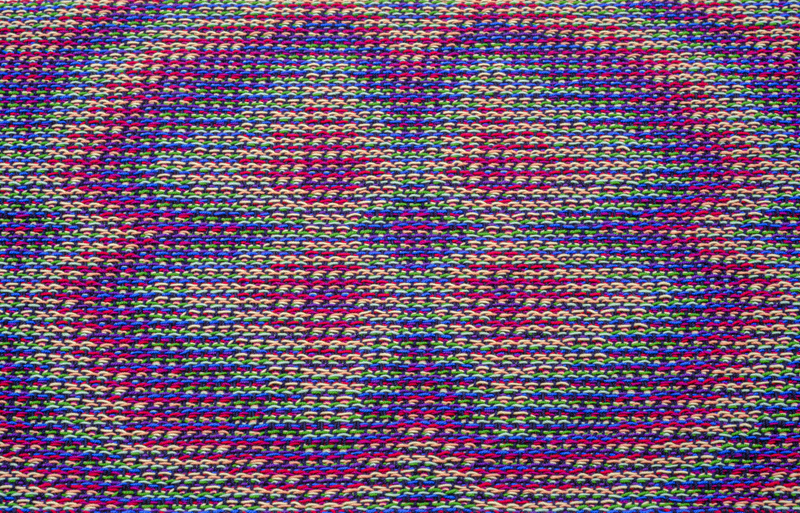
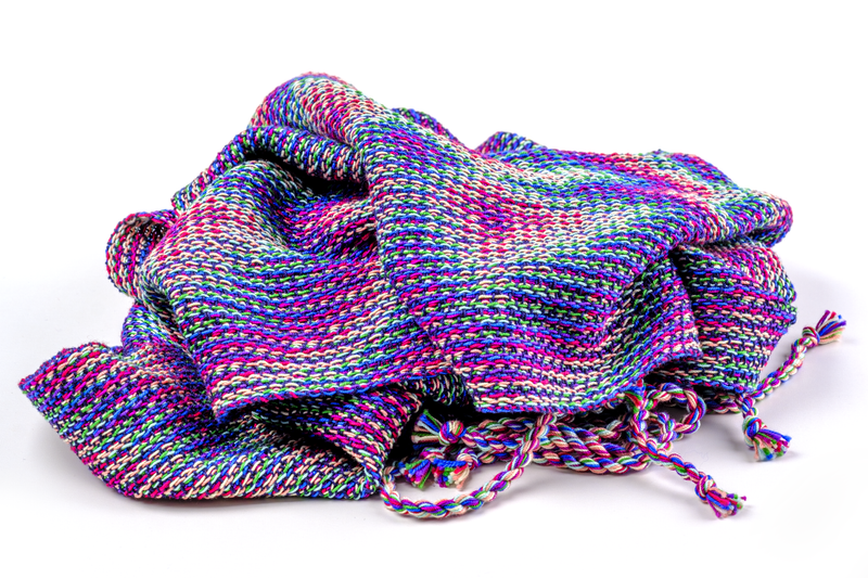
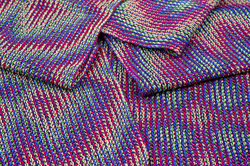
When I arranged my chosen colors in a harmonious circle, they looked quite nice together. However, when seeing the colors thread-by-thread in the warp, I got a bit anxious. The color combination looked rather odd. I am not afraid of lots of color, but I feared this could be too “out there” for me. I decided to hang in there and rely on the beautiful result that Fiberworks had promised me. I am happy I did, because the curious color combination turned out very interesting once woven. Areas dominated by the light tints gradually transition into shade-dominated areas. The marine weft emphasizes the pink, purple and blue shades very nicely, making these colors shine while the tints provide a nice background.
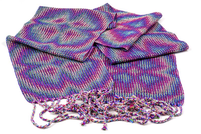
The result is not very rainbow-like, I suspect due to the lack of bright orange and yellow. I wonder whether I can come up with a combination of tints and shades that still captures the rainbow-spirit, but this will require some additional playing around in Fiberworks. I am looking forward to discover other curious color combinations.
