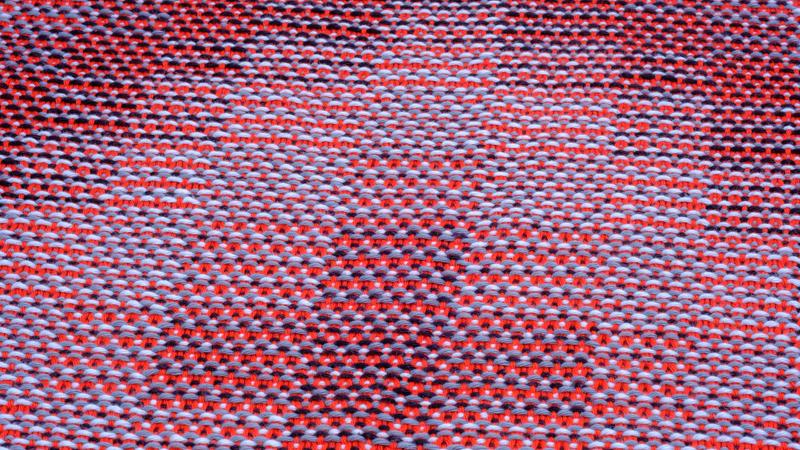
The Corris effect is a great way to achieve a beautiful interplay of colors. Since I love color, I was naturally drawn towards making multiple-colored designs when I first started playing around with the Corris effect. I combined three bright colors in the warp with a background color as weft. After some time, I wondered whether the Corris effect could also be used with a more monochromatic warp. It turns out that Corris gives equally interesting results when toning the warp color contrast way down.
Sticking to the greyscale
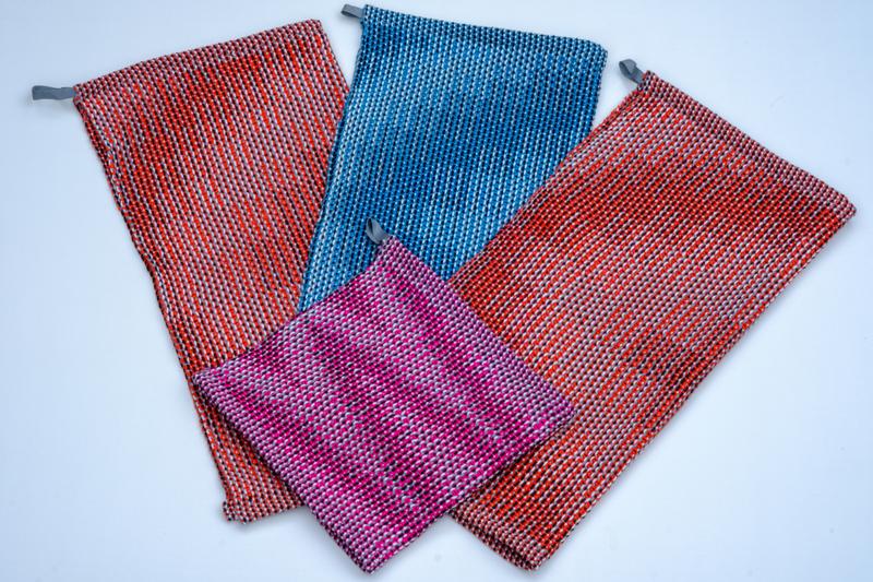
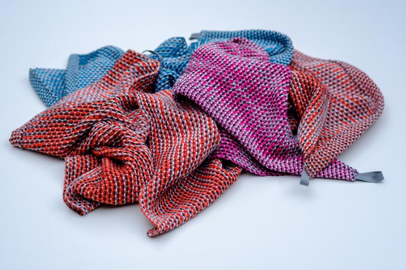
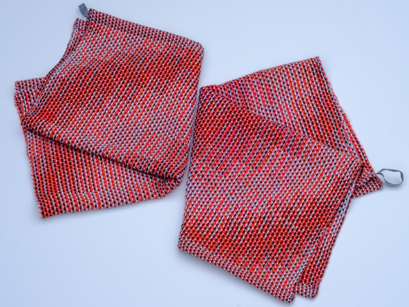
A couple of weeks ago, my sister’s birthday was coming up and I decided to weave her a set of kitchen towels. The perfect opportunity to experiment with monochrome Corris. I decided to switch things around: instead of a colored warp and a background colored weft, I combine light grey, dark grey and black in the warp with a bright colored weft.
I made a generous warp, so that I could make my sister a set of towels and have enough warp left to weave one for myself. In this way, I could try out the monochrome Corris warp with both a bright red weft for my sister and a turquoise weft for myself. I used 8/4 cotton, my go-to yarn for kitchen towels.
Order counts
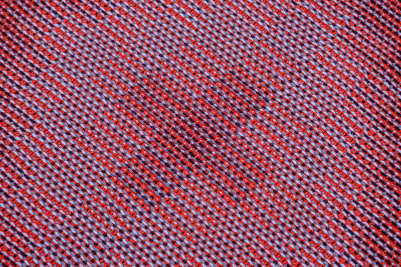
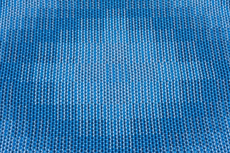
Next up, I had to decide on the design. I wanted a simple yet interesting pattern. Circles are always a good option, so I settled on a towel-covering circular shape. It is not that hard to obtain a circular pattern from a design line made up of blocks of different length. I like how these patterns start with a square in the center, then grow into a diamond shape and ultimately round off into a circle.
Weaving software makes it easy to try out different color orders in the warp. I have noticed that the designs can really look different by changing up the color order of the three warp colors. For three colors, there are six possible orders. In my monochrome case, there are basically two distinct options:
- A gradient: light — medium — dark or dark— medium — light,
- A more random order: light — dark — medium, dark — light — medium, medium — light — dark or medium — dark — light.
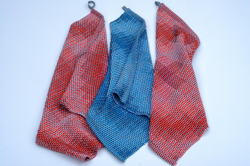
The impact of the color order on the end result varies depending on the pattern and colors in question. Of course, it is also a matter of personal preference which color order is most pleasing. Yet, I do think it is worth the effort to try out the six different possible color orders. I really liked the result for light — dark — medium, so I went with this one.
Adding some color
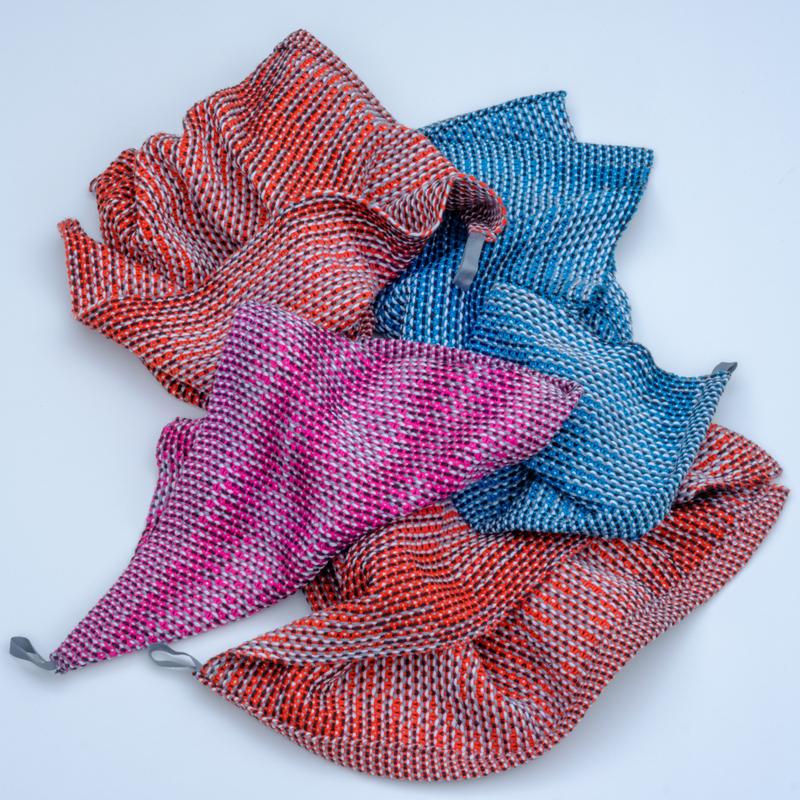
If I am honest, the warp colors on their own did not really excite me. It is much more fun to wind a colorful warp. Yet, this made it even more pleasing to see the boring warp come to live with the red weft. I made two towels for my sister. Both in a circular pattern, but not exactly the same. For the second, I shifted the treadling sequence of the first towel by 4. This made for a set of matching yet unique towels.
I continued by making myself a towel with turquoise weft. When making gift towels, I am always tempted to put on a little extra warp for myself. Especially when the project has an experimental aspect, such as monochrome Corris, I like to keep a sample for myself for future reference.
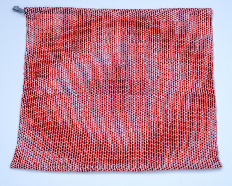
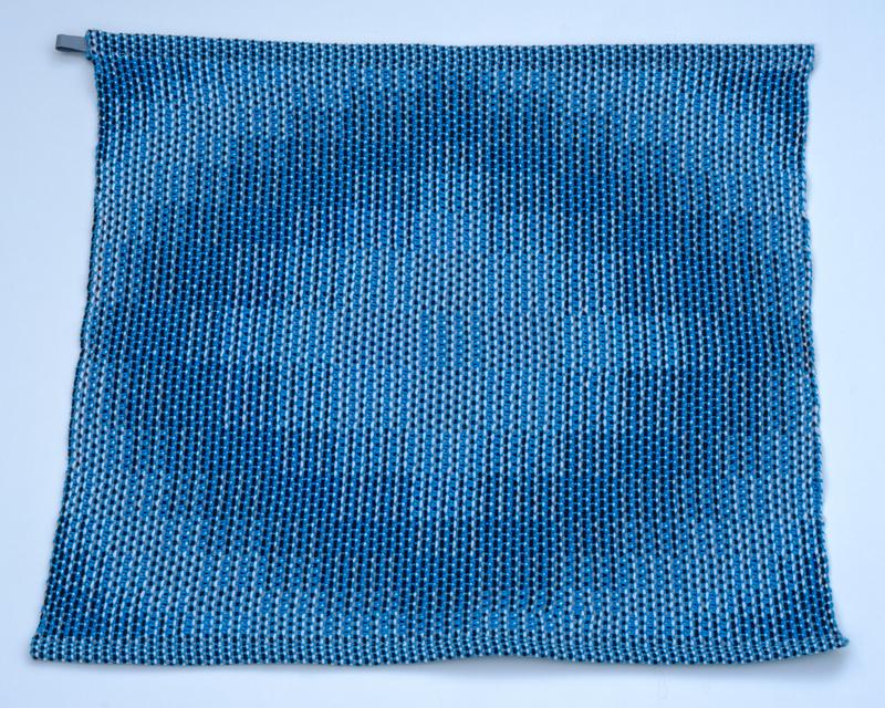
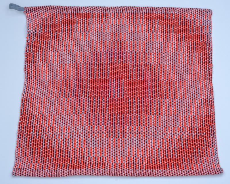
There was even some warp left after weaving the turquoise towel, so I was able to sample some more. I picked up some bright pink weft and shortened the treadling sequence to obtain ovals instead of circles. In this way, I was able to just squeeze out an entire treadling repeat on the remaining warp. I made this last sample into a little guest towel.
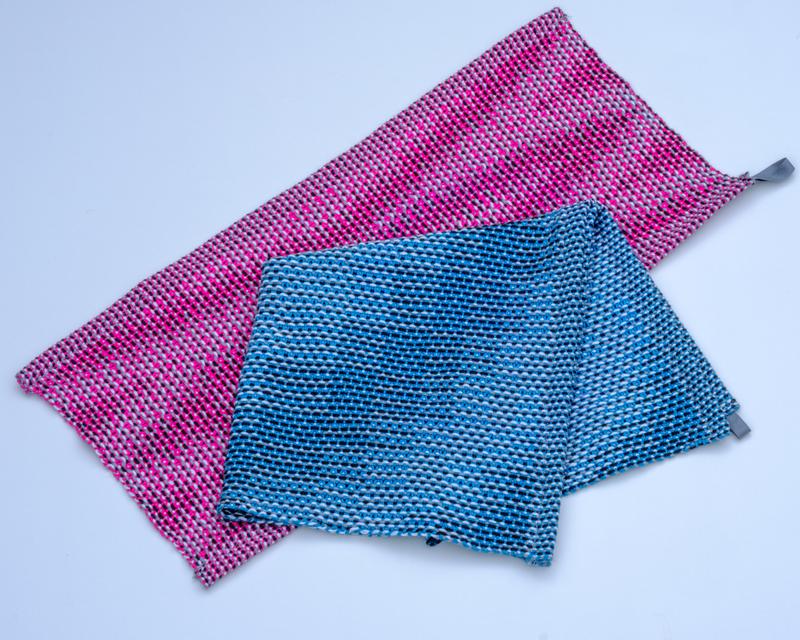
I was happy with how this monochrome Corris experiment turned out — and so was my sister. I imagine Corris can give beautiful results with three shades of any color in the warp, so I will keep on experimenting.
